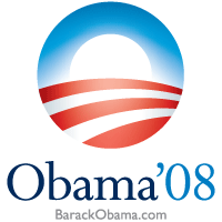
Even if you are not a fan of Obama, you can at least recognize (or at least I hope you do) that the logo his campaign used during his run for the presidency was enormously effective at communicating the images and narratives his campaign was trying to push. I mean, just look at it:

The logo reinforces the Obama campaign's slogans of "hope" and "patriotism" with a clear sun rising over a field.
As the blog “Here Comes The Science” described back in February of last year, http://www.herecomesthescience.com/2008/02/06/the-genius-of-the-obama-campaign-logo/Â in the logo:
By comparison, the other candidates’ logos or emblems did not have a similar level of depth or amount of symbolic connections that Obama’s logo was making with whoever saw the logo. Essential, Obama’s logo was commnicating a lot more (hope, patriotism, change, sunrise, fields-and by extension hard work via allusions to ‘working the land’, etc. without actually using those exact words-just imagery-the only actual text that this logo has is “Obama 08”).Â
More than anything, I think this points to something that a lot of people (even in political circles) do not understand about marketing an “image”: that images, symbolism, and appeals to emotion are much more powerful than making purely intellectual dry-factual ones.  A hybrid of the two is always more powerful of course: making appeals that are first and foremost based on emotional connections but that have factual-based arguments to back up the messaging is of course preferable. However, that doesn’t take away from the power of an appeal that connects with an audience in a more immediate, visceral way.